@m4zuper Вроде починил. Проблема была в антивирусе который жрал 30% оперативы
BrowserAutomationStudio 26.0.0 has been released
-
Improved usability of the action panel. The design of certain interface elements has also been updated. The update is based on changes by @Oyasumi-Punpun .
Introduced changes will be used to better display modules with complex interfaces in the future.
Here's how it looks now:
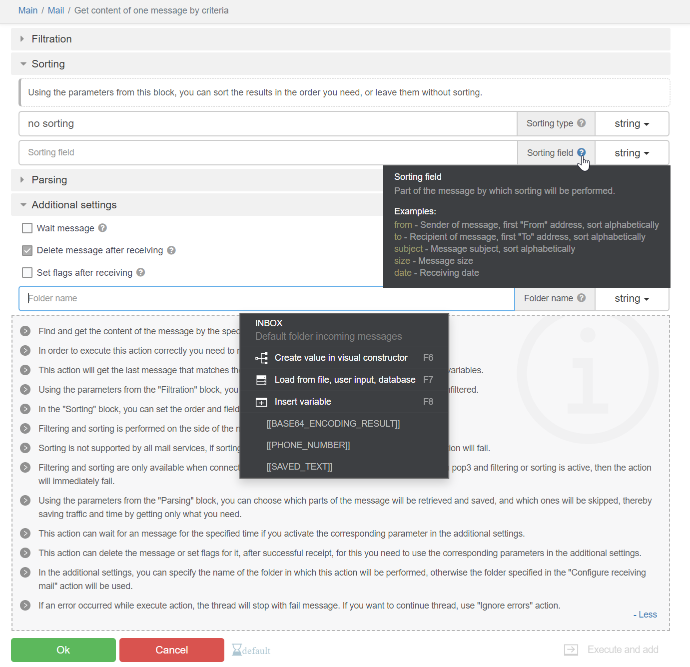
List of changes:
- The interactive documentation panel can be collapsed.
- Gray stripes no longer interfere with reading the interactive documentation.
- The "Execute and add/Only add/Only execute" block is now presented as a dropdown list, taking up less space.
- Tooltips for fields can be pinned with a click, allowing you to copy text from them.
- Instead of checkboxes on collapsible blocks, there are icons for "collapsed"/"expanded" states. So it is clear that collapsible blocks are just an interface element that does not affect the functionality.
- Collapsible blocks now have an indentation inside to indicate which specific setting belongs to which block.
- A new interface element with information allows embedding descriptions into actions and collapsible blocks.
- Ability to search within dropdown list options. This greatly facilitates working with large dropdown lists, for example, in the PhoneVerification module.
- New interface elements for checkboxes, radio buttons, select boxes, and horizontal dividers.
- The action name is now located on the top panel.
- The top panel also contains a link to the page with the list of modules and a link to the module itself. This allows quickly understanding which module the action belongs to.
- Validation errors are displayed in a dropdown window.
- Improved hierarchy of settings for actions that deal with elements.
- The width of dropdown menus cannot exceed the width of the toolbar.
- Fixed issues with flickering page when clicking the cancel button.
- Improved design of many elements.
26.0.1Added Chrome version 115.0.5790.99.
26.0.2Minor UI improvements.
-
Update 26.0.2 has a problem, I don't know if people notice or not.
It will be difficult to bypass "cloudflare" when using Windows fingerprint.
Still good on version 26.0.0.💻 Work with Reputation, Speed, and Quality
🤙 Telegram : https://t.me/basvietnam
💻 Website : https://basvietnam.com/
🎦 Youtube : https://www.youtube.com/@basvietnam/videos -
@BAS-Viet-Nam Fixed.
💻 Work with Reputation, Speed, and Quality
🤙 Telegram : https://t.me/basvietnam
💻 Website : https://basvietnam.com/
🎦 Youtube : https://www.youtube.com/@basvietnam/videos -
@BAS-Viet-Nam Chưa kịp test
-
Is it only me that is finding it really difficult to work with new 'Only Add, Only Execute, Add and Execute' Button Dropdown?
I feel it was good the way before the update with three separate buttons.
I constantly kept using three buttons parallely to test automations. But now, I have to click on button and select from a dropdown. It is cumbersome and also the buttons are small and dim making it even harder.
Earlier their were three buttons with colored combinations and it was so easy to operate with that.
I request you guys to please get the old buttons.
Please don't take me in wrong manner. I like all the other subtle ui changes made in this update but not this one
-
In the new update, while creating variables, I am not able to select Variable type due to UI Issues.
Their is no way I can scroll to select the options too. Please fix this soon
-
For me, it doesn't even show the checkbox to click on cloudflare page.
I have translated your below message. Does it mean the error is because of chrome_command_line functions?
I removed all of them to test but it still doesn't works.
How did you fix this issue?